-
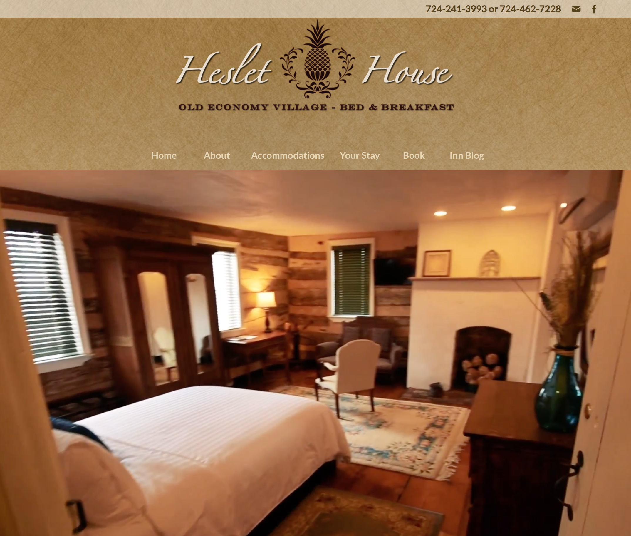 New Homepage: video is used to create a dynamic teaser that draws visitors in to learn more while main nav is consolidated for ease of use
-
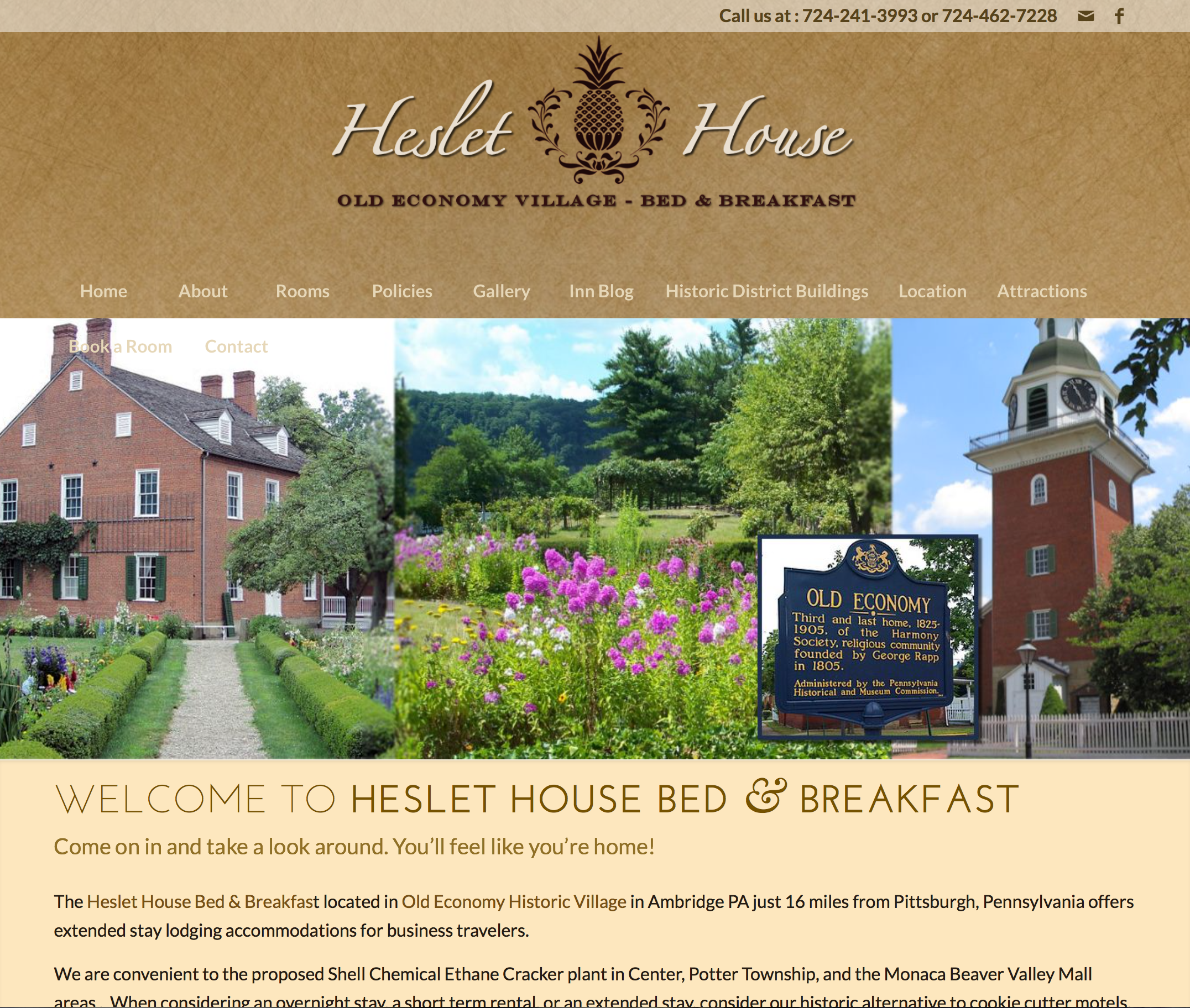 Previous Homepage: rotating banner is cluttered while verbose main nav trails off and offers too many choices
-
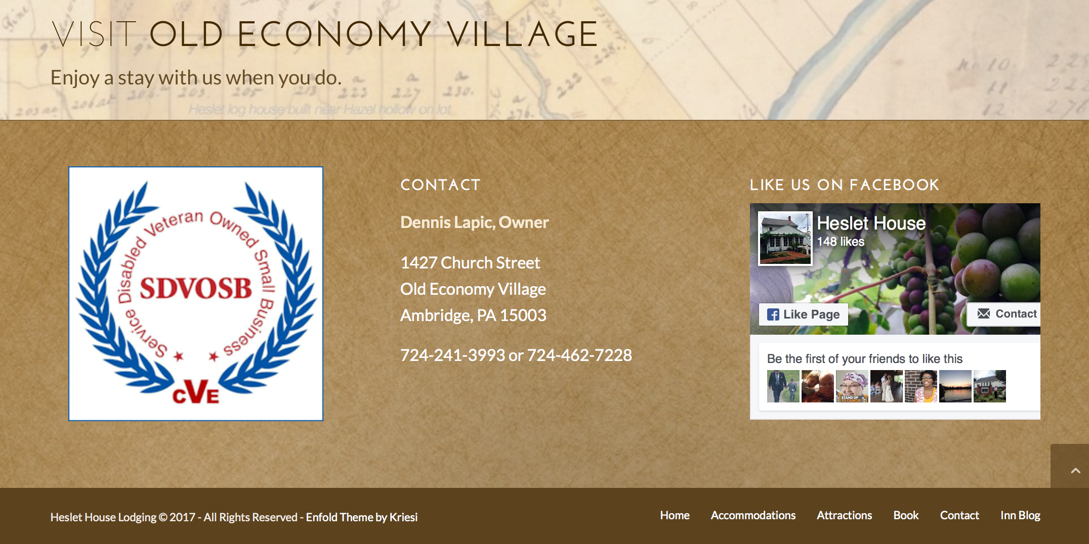 New Footer: pairing down content allows for a cleaner, more legible footer that also mirrors main nav
-
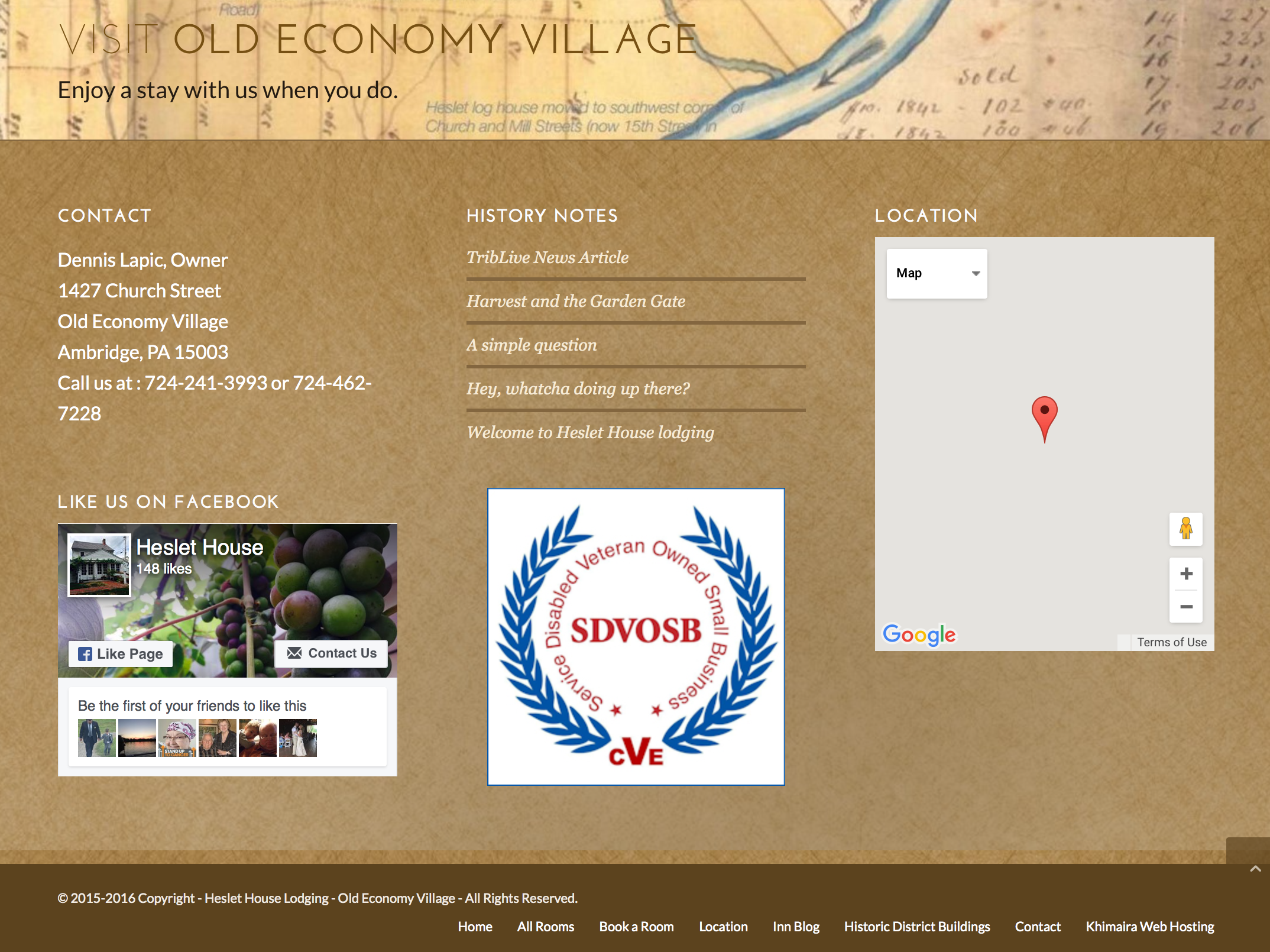 Previous Footer: too much content looks visually cluttered and distracts the visitor while nav is too verbose
-
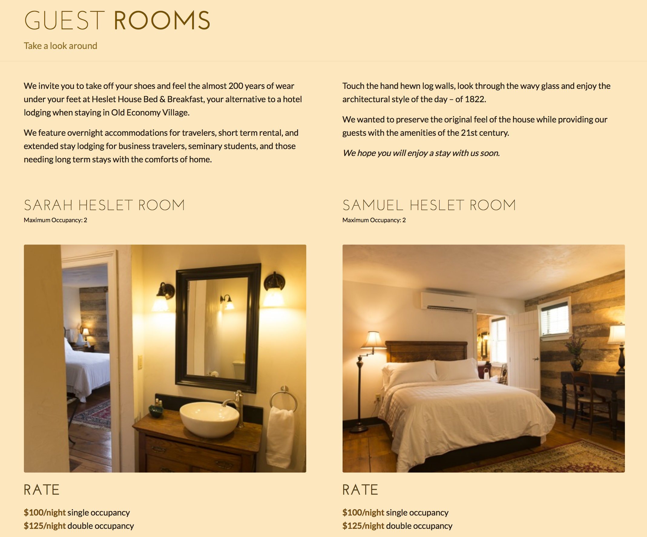 New Accommodations: consolidating all room info to one page is easily browsable while two column layout and cleaner typography make parsing simple
-
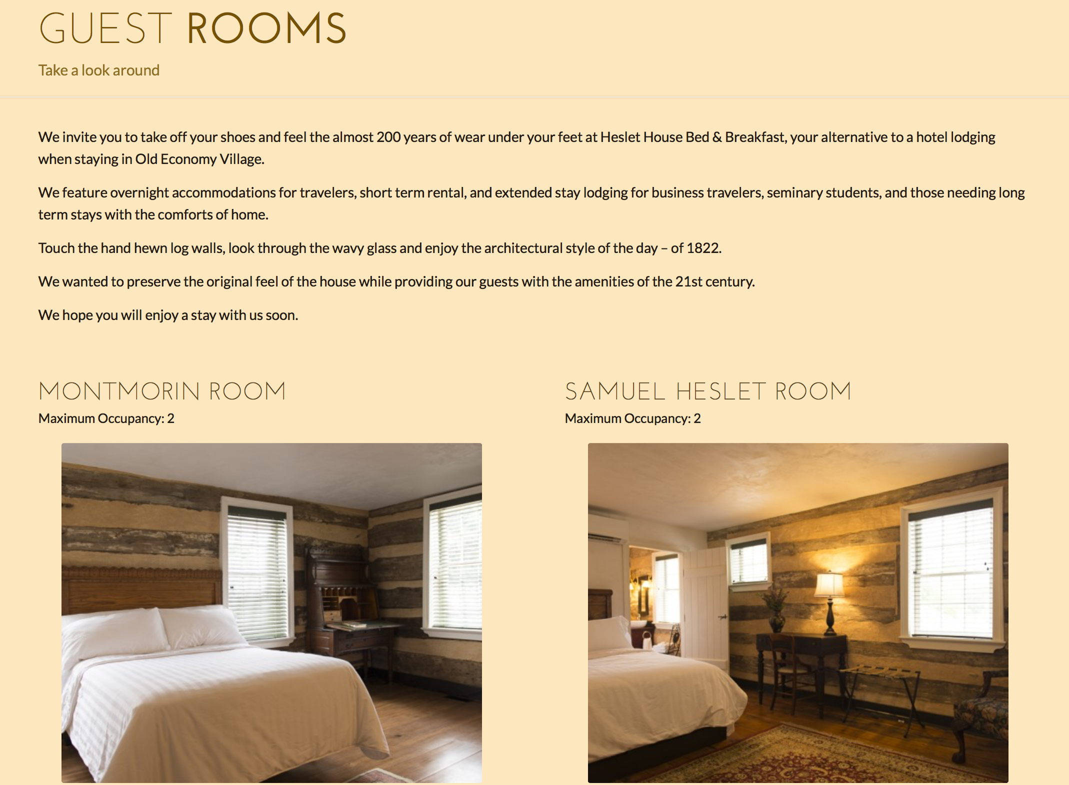 Previous Guest Rooms: block text is difficult on the reader’s eye while information is duplicated for each room on a separate page
-
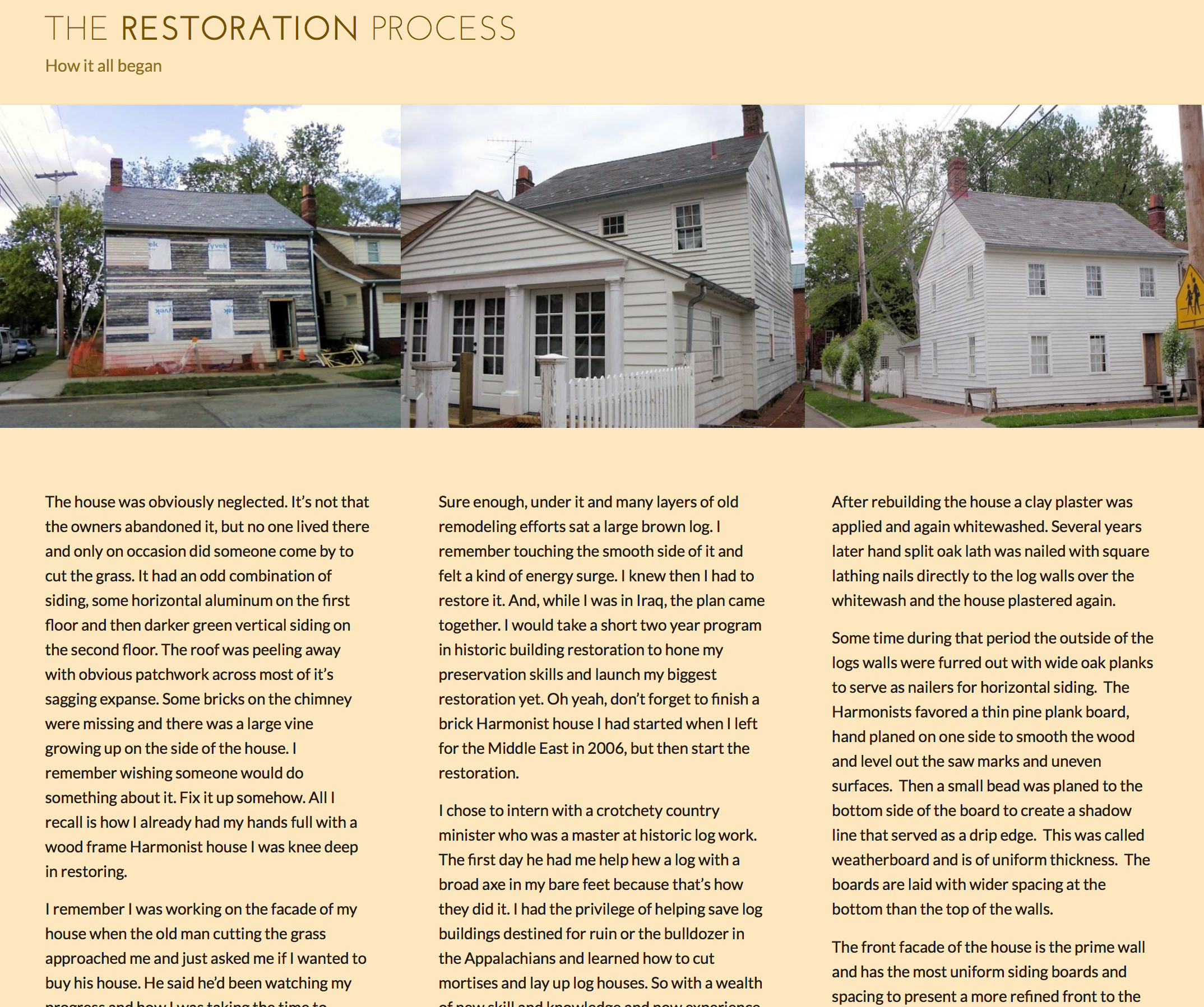 New Restoration Process: the three column layout eases eye strain while galleries above and below the fold break up reading and evidence content
-
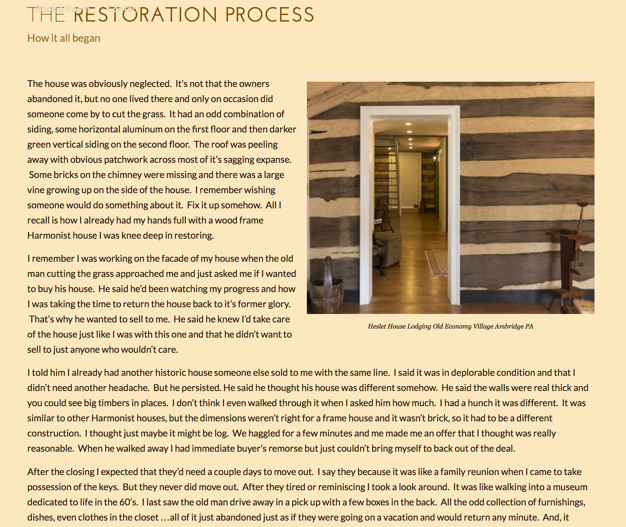 Previous Restoration: this page contains a lot of text that is very hard to read in a block layout
Heslet House Re-Org
Improvements to the Heslet House bed & breakfast website with an eye towards legibility, accessibility and navigability for visitors of all stripes.
- Category
- Information Design, Web Development
- Skills
- consultation, information synthesis, video editing, web design, writing
- Project URL
- heslethouse.com