Visualizing Impact
My team is a big fan of infographics, and who can blame us? They make just about any topic more understandable and also serve as great expression of graphic design chops. Plus, they are just fun to look at. So we thought it might not be a terrible idea to turn one of our staid, numbers-heavy event wrap up reports into an infographic of our very own. The recent Spring 2012 Forum at Berks seemed like the prime candidate and – with the help of both Lauren and Carla – I turned this around in a little over a day of planning and tinkering in Illustrator and Photoshop:
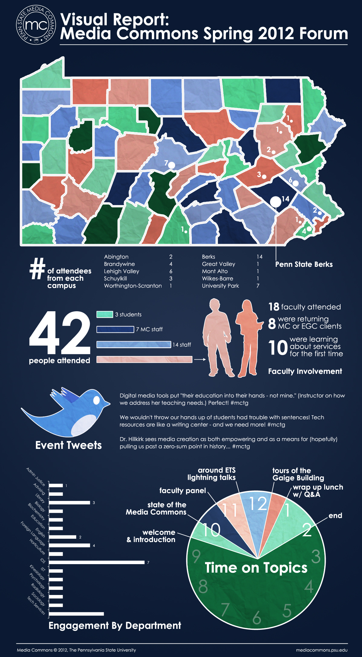
I think there’s the potential for this to expand to cover even more Media Commons events as well as our semester reports and wrap ups.